Information catastrophe of the century
What if death by PowerPoint were not a metaphor?
•
For most of us, it is not exactly a matter of life and death how well we present. But for our projects, and our businesses, it can be!
Here's how things can go seriously wrong when presentation design fails.
On a cold January morning, in 1986...
to the shock of all spectators around the NASA launch site, the space shuttle Challenger exploded in mid-air, taking down 7 talented and highly trained astronauts with it.
This left their families mourning, and throttled a billion dollar project.
What makes this event especially tragic is that the engineers working on the project in fact knew that this was going to be a very high risk launch.
They gathered up their data, and booked a meeting with their superiors to get them to postpone the launch.
So, why did this happen?
Oh, the O-rings
Tragical miscommunication
The engineers knew from previous launches that certain parts of the booster rockets, the rubber seals called O-rings*, tended to break down when temperatures got cold.
* These rings are similar to the seals on pipes underneath your sink, that keep fluids from leaking. If they fail, you'll get a moldy kitchen, or water all over your floors.
In the booster rockets, they were meant to keep the exhaust fumes from burning rocket fuel from leaking in awkward directions.
And the planned launch day was predicted to be exceptionally cold, near freezing.
You can guess what failure would come to mean.
Exactly - that zigzag of smoke you are seeing in the picture from the disastrous launch.
Unfortunately, when the engineers gathered up their data from all launches, and booked a meeting with their superiors to try and convince them to change the launch date,
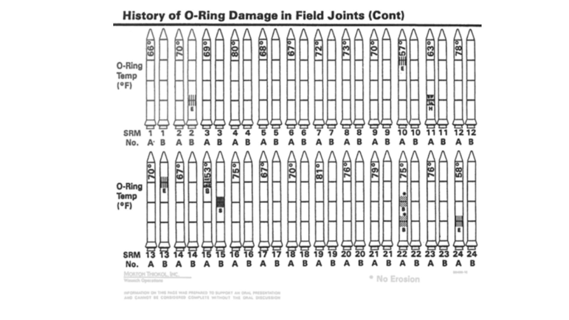
THIS is what they showed:

At a quick glance, it’s quite impossible to see what this chart is even about.
The engineers were used to looking at these charts, of course, and they knew very closely what had happened during each launch.
But for anyone else, especially busy decision makers under pressure to keep tight schedules, this simply didn’t bring out the critical information clearly enough.
What am I seeing?
The graph shows tiny rocket images ordered by date of launch. The black smudges show the location of damage.
These rocket images here are the very essence of what Edward Tufte, the grand old man of information visualization, calls CHART JUNK. That means unnecessary visual clutter that doesn’t carry the critical information.
While the location of the damage might be critical for analysis of damage, here the message was on a higher level: As temperatures go down, the risk of damage goes up.
Say that again..?
From detailed observation of these data, it can be deduced that the colder it gets, the higher the risk of failure. We just can't really see it from the graph.
A far simpler plot showing temperature and risk of damage would have done a better job of explaining it.
This relationship between temperature and damage was quite clear in the heads of the engineers, but they just couldn’t get it through to their bosses, who were the ones who COULD have made the life-saving decision to move the launch date.
Sadly, as a result, those 7 astronauts lost their lives.
Could this be happening to you?
All of us can recall seeing some presentations like this: An overwhelming array of information placed before your eyes, so much that you don't know how to start unraveling it.
Do you think you might have done the same?
If you feel a small sting in your heart, you are not alone.
As an expert, you know the concepts inside and out, and every word means a whole world to you. Every graph you produce is the result of long hours, days, weeks spent thinking and tinkering with the data. It required years of getting familiar with the tools of analysis.
And when you have years of experience in a field, it's not easy to look at things with fresh eyes.
To someone from a different field, who’s new to our topic, those same words might not carry any meaning at all. Or they might mean something entirely different. And the graphs might be beyond grasp.
If that is the case, our explanations will drift in through one ear and out through the other. For getting ourselves understood, it is critical that we limit the information overload.
Design for clarity
How to make sure your own slide designs don't fail at the starting line?
The #1 thing you can do to make sure your slides don't overwhelm is to distill the information.
So take a step back from all the details you wanted to share, and ask yourself: What would be the most important thing you'd like to get understood and remembered?
Try to answer it overall for your presentation or infographic, then repeat for each individual slide.
For each individual element in your layout, then, ask in turn:
Does it help you get that one thing across? If not, ditch it.
It sounds like an innocent question, but letting go of the non-critical details is not easy to do. It's worth asking yourself this again and again.
What about all the important details, then? Often, they can be shared in a different document, in an appendix, or online. Just make sure it is clear where to find the info, and when to look for it.
Looking for concrete examples?
Coming up next:
5 Ways to fix your unreadable slides
Agree? Disagree? Want help with your deck? Message me anytime at hello@presentation.ninja

